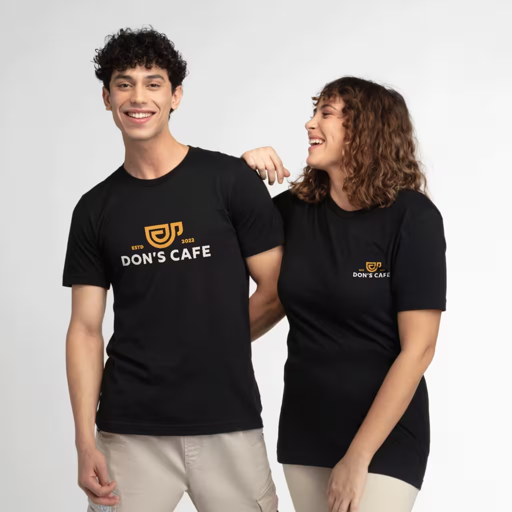
Print-ready artwork for a custom T-shirt means a clean file built at full print size, usually at 300 DPI, with the right colour mode and a transparent background. For logos and lettering, vector files work best because they scale cleanly, while photos need high-resolution raster files. If you check format, size, colour, fonts and placement before you send the file, you avoid most delays and reprints.
What Does Print Ready Actually Mean?
Print ready is a simple idea. It means your file has everything the printer needs to print without guessing or fixing. The size is correct, the resolution is high enough, the background is clean and the colours are set for ink on fabric.
A printer can only print what the file contains. A sharp logo on your phone screen can still print soft if it was saved for the web at a small size. That is why most order delays trace back to the file, rather than the garment.
Think of it like giving measurements to a tailor. Clear inputs give a clean output. Vague inputs lead to trial and error. For a first-time designer in India, learning this file habit early saves money across every future drop.
Oowia is a vertically integrated facility, with knitting, dyeing, printing and garmenting under a single roof. The team is backed by Ambuja Knitting Mills, a 70-year-old B2B knitted fabric manufacturer. That in-house control helps keep shade, sizing and print output consistent from one order to the next.
Which File Format Should You Send?
File format decides how flexible your artwork stays. Vector art is built from paths defined by maths, so it scales to any size with sharp edges. Raster art is built from pixels, so enlarging it stretches those pixels and softens edges.
For logos, text and flat graphics, send vector where possible. Good options include AI, EPS, PDF with live vector, and SVG. These keep lines crisp and colours clean for most print methods. You can read more about method limits in this detailed comparison of print methods for small batches before you lock your file.
For photos, gradients and textured artwork, send high-resolution raster. Good options include layered PSD or TIFF, or a PNG with transparency built at full print size. A high-resolution JPG can work in some cases, though it has no transparency and can show compression marks near edges.
Avoid files pulled from Word or PowerPoint, GIF, BMP, screenshots and tiny web exports. As explained in this guide to custom apparel printing success, choosing the right format at the start protects print sharpness. Popular tools for this work include Adobe Illustrator, CorelDRAW and Affinity Designer, all of which support vector setup and print specifications.
How Do Resolution and Print Size Work Together?
Resolution only makes sense with physical size. The working standard is 300 DPI at the final print size. A 12 inch wide chest print needs roughly 3600 pixels of width to hold detail.
Web images are often built for screens at around 72 DPI and at small pixel sizes. They look fine on Instagram or a product page. When enlarged for a chest print, the same pixels spread out and edges turn soft.
Always check actual pixel dimensions, rather than trusting the DPI label alone. DPI can be relabelled without adding real detail. Open the file properties, look at width in pixels, and compare it with the print width you want in inches.
You can sometimes manage with around 150 DPI for very large single-colour shapes with no fine detail. Treat that as a compromise for posters or oversized backs, rather than a target for chest logos or small text. When in doubt, build bigger and sharper from the start.
How Should You Set Colours for Fabric Printing?
Screens show light, fabric shows ink. Your monitor uses RGB, while most print workflows use CMYK process colour or Pantone spot colours. Bright RGB blues, neon greens and glowing tones often print a shade quieter in real ink.
For screen printing, each colour is usually mixed to a Pantone reference and printed through a separate screen. Naming the Pantone number removes guesswork when brand consistency matters. Fewer solid colours also keep setup simpler.
For digital methods like DTG and DTF, the file can carry full colour, gradients and photographic detail in one pass. DTF handles vivid graphics well, while DTG prints water-based ink directly into the fabric and favours cotton-rich garments. Oowia runs DTG, DTF, screen print, all-over print on cotton and polyester, vinyl, puff print, HD prints and glow-in-the-dark prints, among others.
Preview your artwork on a background that matches the actual shirt colour. A cream graphic can look premium on black and vanish on heather grey. The notes on artwork for shirt printing explain why approving colour on a printed proof is safer than approving it on a phone screen.
How Do You Prepare Fonts, Backgrounds and Layout?
Small file habits make a large difference. Convert text to outlines or curves before sending the file. If the printer does not have your font, live text can reflow to a substitute and change your design without warning. Keep an editable master copy for yourself, since outlined text cannot be edited later.
Remove backgrounds you do not want to print. PNG and vector files support transparency, JPG does not. A white box behind a logo will print as a white box, especially on dark shirts where a white underbase is used.
Embed or package any linked images. A vector file that links to an external photo can arrive as an empty box. Keep layers organised and labelled, so the printer can see what belongs to each print location.
Use real placement sizes in inches, rather than percentages. Common starting points in the trade are:
- Left chest: 3 to 4 inches wide, often placed 7 to 9 inches down from the shoulder seam
- Full front: 10 to 12 inches wide, with the top set a few inches below the collar seam
- Centre chest: 6 to 10 inches wide for minimal layouts
- Full back: 10 to 12 inches wide for sponsor lists or large artwork
- Sleeve: 2 to 4 inches wide for small logos or icons
These ranges shift with garment size and cut. A graphic that fits an adult XL can overpower an adult small, and youth sizes need a scaled-down version. This ultimate guide to T-shirt design gives useful layout context for front, back and sleeve placements.
If you are testing ideas for an influencer drop, a college fest or a side hustle, start with one hero placement. A clean full front on a Men's Premium Cotton T-Shirt, ₹159 or a left chest on a Women's Premium Cotton T-Shirt, ₹159 photographs well and keeps your first sample simple to review.
What Checklist Should You Run Before Sending Files?
Run this check in order. It takes ten minutes and prevents most back-and-forth.
- Confirm one file per print location, named clearly, such as front, back or sleeve.
- Confirm vector where possible, otherwise raster at 300 DPI at final print size.
- Confirm transparent background with no stray white box or hidden layers.
- Confirm fonts are outlined and linked images are embedded.
- Confirm colour mode is set for print, with Pantone numbers noted where exact match matters.
- Confirm print width in inches for every location, plus shirt colours and sizes.
- Zoom to 100 percent and check edges, small text and thin lines for softness.
Set bleed and margins where your printer asks for them. A common guide is 0.125 inches bleed and at least 0.25 inches safe margin, though needs vary by method and equipment. Ask your manufacturer for their preferred spec sheet before export.
For B2B buyers ordering staff uniforms or for dealers buying for resale, add one more line to the checklist. Note fabric choice and print method next to each design, since cotton, blends and polyester behave differently. That note helps the factory match artwork to the right press without delay. When your sample arrives, use this simple sample checklist before bulk approval to review print sharpness, colour, fit and feel.
What Should You Do After Your File Is Ready?
Order a sample before any bulk run. Photos and mockups help, though they cannot show hand feel, ink depth or true fit. A physical sample lets you check placement on the body, readability from a distance and comfort after wash.
Share clear notes with your file. Mention print method, shirt colour, print width and where the top of the design should sit. The cleaner the brief, the faster the team can confirm the file and move to production. Since everything at Oowia happens in one location, orders ship as one parcel, which saves split-shipment hassle for small brands and bulk buyers alike.
Keep your source files organised for reorders. Save the editable master, the outlined print file and the approved proof in one folder. That folder becomes your brand asset for Instagram restocks, dealer reorders or festival season repeats.
Start small, learn from the first print, then expand colours, placements or products. Many working professionals begin with a single design on a core tee as a side hustle, then add oversized fits, full sleeves or all-over prints once sales steady. If you plan to grow, this practical guide to scaling your fashion brand outlines how to test designs and widen the range without holding stock.
Good artwork is a skill you build once and reuse for years. Build at full size, keep backgrounds clean, outline fonts and match the file to the fabric and method. Do that consistently, and your prints will look sharp from the first sample to the fiftieth reorder.
